Do you get tired of recreating the same PowerPoint decks each month when your numbers change? Wouldn't it be great if you could just push a button and have the numbers in your ppt slide update to what is in the database? Wouldn't it be even better if the data was used in visually rich MS Office objects such as tables and charts? And, wouldn't it be awesome if you could interact with the data in real time during your presentation?
Well, did you know Smart View for Power Point does all of that? That's right I said Smart View for PowerPoint; Smart View is not just for Excel.
Smart View has had the functionality to work with the MS Office suite for some time, but frankly the functionality outside of Excel has been limited and challenging to work with at times. While the Power Point and Word functionality are not 100%, they have come a long way and with some patience you can make some really nice PowerPoint slides that are interactive with your underlying EPM data sources.
At Kscope18 I did a presentation with fellow Oracle Ace and GE colleague Gary Adashek. We did a Shark Tank style pitch to "investors" on why they should help us "Save The Beverage Company". If you don't know what The Beverage Company is, your Essbase street credit is going to take a serious hit. Of course I am referring to the fabled bottling company made famous by the Essbase Sample Basic database. Gary and I figured we could use our Smart View skills to create some really slick ppt slides to convince the investors to help us save this favored institution that had been around since the Arbor days. Besides having some fun trying to convince our panel of investors (see the Photoshop pics at the end of this post) while the audience watched, we wanted to convey the very real message that you can do some interesting things in PowerPoint with Smart View.
In my effort to communicate useful EPM tips across various mediums, this seemed like a good topic for a blog post. In this tutorial, I am going to walk through how to create interactive Smart View objects in PowerPoint. I am working with Essbase 11.1.2.4, Office 2016, and Smart View 11.1.2.5.800. I suggest using this latest version of Smart View since it has some fixes in it specifically associated with PowerPoint.
The first thing you will need to decide is how you are going to link your source data to your ppt. You have three options to create what is referred to in Smart View as a 'function grid'. You can base your function grid on
Each one of these have their pros and cons PBCS data forms seem to have the most functionality while also being the most stable. HFR grids are stable, but they lack the ability to change the POV after they have been turned into a function grid. Excel has the most functionality in terms of different objects, but it is less stable since you are creating the function grid from an ad hoc report in Excel.
First step is to either create a form or select one that has the data you are looking for. Keep in mind if your goal is to make a chart, not all forms are set up correctly to make a nice chart. In my experience so far, I have created a separate folder for forms called 'Forms for PPT' where I save the ones I have created specifically for this purpose.
This is the form I created for demonstration. You can see it is pretty straightforward, but note that I did add a dimension to the Page section of the form; you'll see why in a little bit.
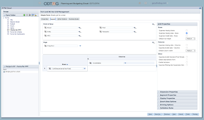
When working with a Data Form or HFR report as a source you can begin directly from Power Point; there is no need for Excel.
Steps
Well, did you know Smart View for Power Point does all of that? That's right I said Smart View for PowerPoint; Smart View is not just for Excel.
Smart View has had the functionality to work with the MS Office suite for some time, but frankly the functionality outside of Excel has been limited and challenging to work with at times. While the Power Point and Word functionality are not 100%, they have come a long way and with some patience you can make some really nice PowerPoint slides that are interactive with your underlying EPM data sources.
At Kscope18 I did a presentation with fellow Oracle Ace and GE colleague Gary Adashek. We did a Shark Tank style pitch to "investors" on why they should help us "Save The Beverage Company". If you don't know what The Beverage Company is, your Essbase street credit is going to take a serious hit. Of course I am referring to the fabled bottling company made famous by the Essbase Sample Basic database. Gary and I figured we could use our Smart View skills to create some really slick ppt slides to convince the investors to help us save this favored institution that had been around since the Arbor days. Besides having some fun trying to convince our panel of investors (see the Photoshop pics at the end of this post) while the audience watched, we wanted to convey the very real message that you can do some interesting things in PowerPoint with Smart View.
In my effort to communicate useful EPM tips across various mediums, this seemed like a good topic for a blog post. In this tutorial, I am going to walk through how to create interactive Smart View objects in PowerPoint. I am working with Essbase 11.1.2.4, Office 2016, and Smart View 11.1.2.5.800. I suggest using this latest version of Smart View since it has some fixes in it specifically associated with PowerPoint.
The first thing you will need to decide is how you are going to link your source data to your ppt. You have three options to create what is referred to in Smart View as a 'function grid'. You can base your function grid on
- A Hyperion Financial Report (HFR) grid
- A Data Form (Hyperion Planning, (e)PBCS, and HFM-presumably-I have not tested)
- An ad hoc Smart View retrieve in Excel.
Each one of these have their pros and cons PBCS data forms seem to have the most functionality while also being the most stable. HFR grids are stable, but they lack the ability to change the POV after they have been turned into a function grid. Excel has the most functionality in terms of different objects, but it is less stable since you are creating the function grid from an ad hoc report in Excel.
Forms
So to start off let's take a look at building a ppt slide using a PBCS form as a source for a chart.First step is to either create a form or select one that has the data you are looking for. Keep in mind if your goal is to make a chart, not all forms are set up correctly to make a nice chart. In my experience so far, I have created a separate folder for forms called 'Forms for PPT' where I save the ones I have created specifically for this purpose.
This is the form I created for demonstration. You can see it is pretty straightforward, but note that I did add a dimension to the Page section of the form; you'll see why in a little bit.

When working with a Data Form or HFR report as a source you can begin directly from Power Point; there is no need for Excel.
Steps
- Open Power Point and start with a blank presentation
- Connect to your data source, in this case PBCS, and navigate to Forms folder and select the form you created as the basis for your chart
- At the bottom of the Smart View panel, click on 'Insert Chart'
- Be patient this step may take a minute or so while Office renders the object
- It may also be a good idea to ensure Excel is closed before doing this. I have found that if Excel is open prior to inserting the chart it times out. Technically they are using the Excel chart engine to render the chart and insert it into Power Point
- Once the chart is rendered you can resize it and move it around your slide to desired location. I do not recommend trying to move it to another slide, if you want it on another slide it seems best to repeat the steps.
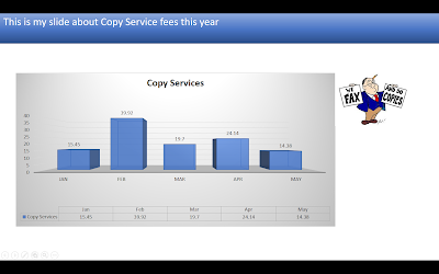
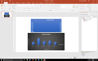
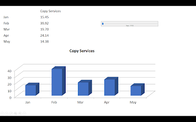
- Once the chart is created you can now make changes to it as you would a typical Office object. You can go to the chart designer and change the chart type or the color theme or various other options. Smart View does provide some of the options in a pop-up menu you will see if you click on the chart, but the options there are similar to the ones on the chart design ribbon, with the exception of the filter function, which allows you to filter out certain members. The filter function gives the option to potentially use a large form with a lot of data and then filter it in ppt, rather than having to create multiple forms. You can also insert your regular ppt content and wind up with something that looks like this.
-
- Now that I have a nice chart I can take it one step further and make it interactive. Remember before when I mentioned I put a dimension in the page section of the form? Let's go back to the Smart View panel hit the drop down next to the little house icon and select 'Document Contents'. Click on your function grid and then at the bottom of the panel click on 'Insert Reporting Object/Control'. Now, click on the POV object
- You will see a grey box inserted onto the slide. Note that this POV box will not become active until you enter Power Point presentation mode. While in presentation mode you can hit the drop down next to the dimension member that was placed in the Page section of the form and select a different member; hit the refresh button and your objects will re-render with the new data.


So you can see that I was able to very quickly create a presentation quality image based off my PBCS data. Next time my data changes, I can open this ppt file, go to Smart View refresh and the object will pull in the new data and update the object accordingly.
HFR Grid
Next, let's look at how to insert a HFR report
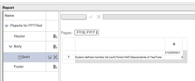
The steps for inserting an HFR report are similar but there are a few differences. First, like the data forms, you need to start off with a report that has the data you want. I created an HFR report similar to the data form in previous example.
Steps
There are a number of options to play with to get the format the way you would like. Note that from time to time I have encountered a few bugs and some inconsistencies in behavior between data sources. I encourage you to log an SR with Oracle for any you come across to get this product working as well as possible.

Steps
- Open Power Point and start with a blank presentation
- Connect to your data source, in this case we are still using PBCS but we are going to choose the Reporting provider instead of the EPM provider. Navigate to the folder where you saved your report and select it. Then hit the Open link at the bottom of the Smart View panel
- When you click Open, the Import Workspace Document window will open. By default you can import the report as an image, but we want to hit the drop down and select Function Grid instead
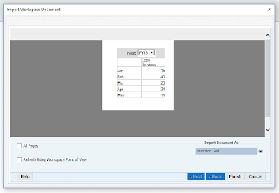
- Click Finish
- You will be taken back to your slide and the Document Contents pane will be active in the Smart View panel. Click on the Insert New Reporting Object/Control link
- A new window pops up, scroll down and select Chart (note there is no option for POV). Your chart is inserted and associated with the function grid, same as above with PBCS form.


You can now work with the chart the same way you did in the steps above. So now, let's take a minute to explore some of the other objects (note these work the same if you are using a form).
- Return to the Document Contents pane, select your function grid connection and insert another object

- This time let's add an Office Table
- Once the table is inserted, click on the table and then go to the PowerPoint Design Ribbon and select a format for the table; you can then repeat for the chart. You may also want to increase the font for the table.
- Insert a new slide into your ppt
- On slide 2, insert a new reporting object/control, select Function Grid
- Note that unlike the Office table, the function grid inserts multiple text boxes, some with labels, and others with active data links to your data source. You can arrange these objects anywhere you would like and again click on the design ribbon to alter the way the object are formatted.


Excel
For the last data source, let's look at an ad hoc from Excel. Note I will use PBCS but this works for other data sources such as Essbase as well.
Steps
- Open Excel and start with a blank workbook
- Connect to EPM data source via Smart View
- Using ad hoc analysis, create a basic retrieve
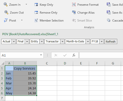
- Select your data range by dragging mouse over the cells with data
- Go to Smart View ribbon and click Copy (note this is not the same as Excel Copy or ctrl + C)
- Open Power Point blank presentation
- Go to Smart View Ribbon and click Paste (note this is not the same as Paste on the Home ribbon or ctrl + V)
- At this point you will see that the function grid is actually placed in the slide. Go ahead and run the refresh

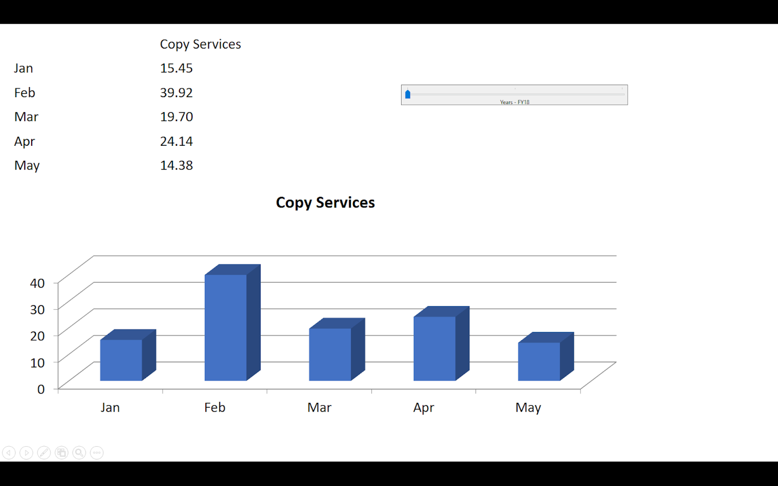
- Now let's add a chart and a POV slider: go to Smart View panel and go to document contents, select your Smart View link, and then click on Insert New Reporting Object/Control.
- Select chart
- Go back to Document Content, select your Smart View link, and then click on Insert New Reporting Object/Control.
- Scroll to bottom and select Slider
- Select the dimension you want the slider for, I am going to choose Years, with members FY18, FY17, and FY16.
- Now when I enter presentation mode, my slider becomes active. I can use my mouse to slide to different year selections


Conclusion
There are an endless number of combinations and examples I could show, but I think this is a good stopping point. If you were able to follow along and complete the steps you now have the basic understanding of how to create Smart View Power Point objects that are linked to your EPM data source. Experiment with different objects, and different data sources; I think you will find some very cool features. Don't be discouraged if you run up against something that doesn't work right, the Oracle team has been very responsive and you just need to log an SR so they become aware of the issue. Sometimes it is what we are doing, sometimes it is bug, but as I said at the beginning of the post, the product has come a long way and I believe it can be very useful in the hands of the right users.
Best of luck, let me know your thoughts in the comment section.
Post-Conclusion
Pics from Kscope18 Save The Beverage Company presentation
1. Meet The Sharks, The Founders, and The Presenters!

Comments